You wouldn’t put on makeup without applying moisturizer; your gown without the proper undergarments; your shoes without a pedicure—so why would you go to the nines with your wedding décor without thinking about your stationery?
From the moment you eagerly send out your save the dates to the content sigh gasped when you drop off your thank you notes at the post office, and all of the moments and pieces in between, there should be a sense of cohesion that both reflects your taste as a couple, as well as the desired mood of your nuptials.
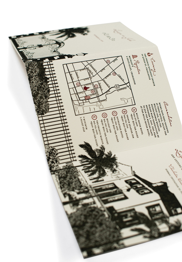
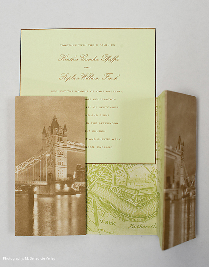
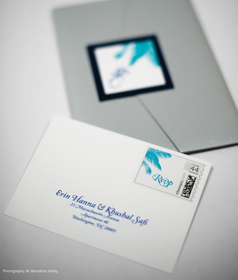
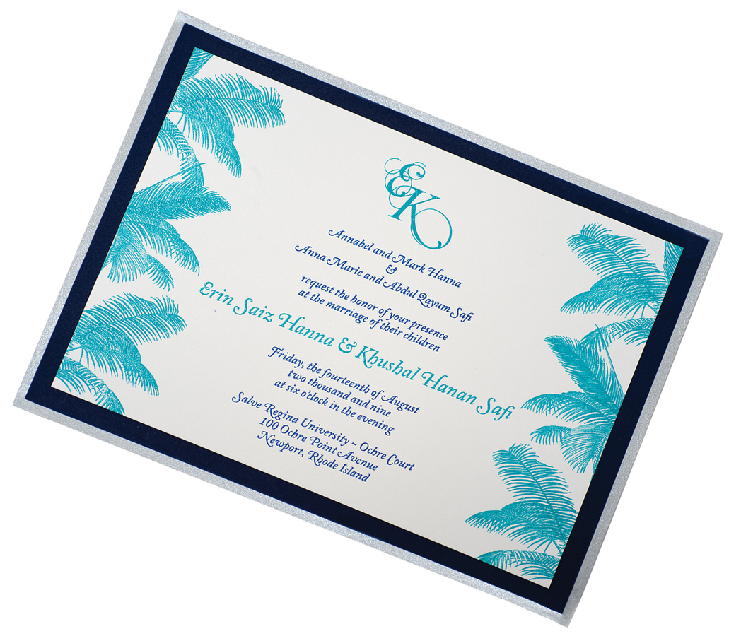
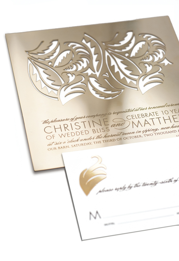
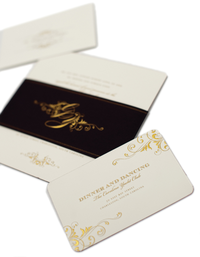
Wedding stationery—invitations specifically—are more than just an opportunity to invite your guests to join you in the celebration of your marriage. They are quickly becoming a popular way to tell a story. From the graphics, typography, paper stock and color, envelopments, bands, folds, die cuts, printing method, alignment, size, shape, even down to the stamp and more.

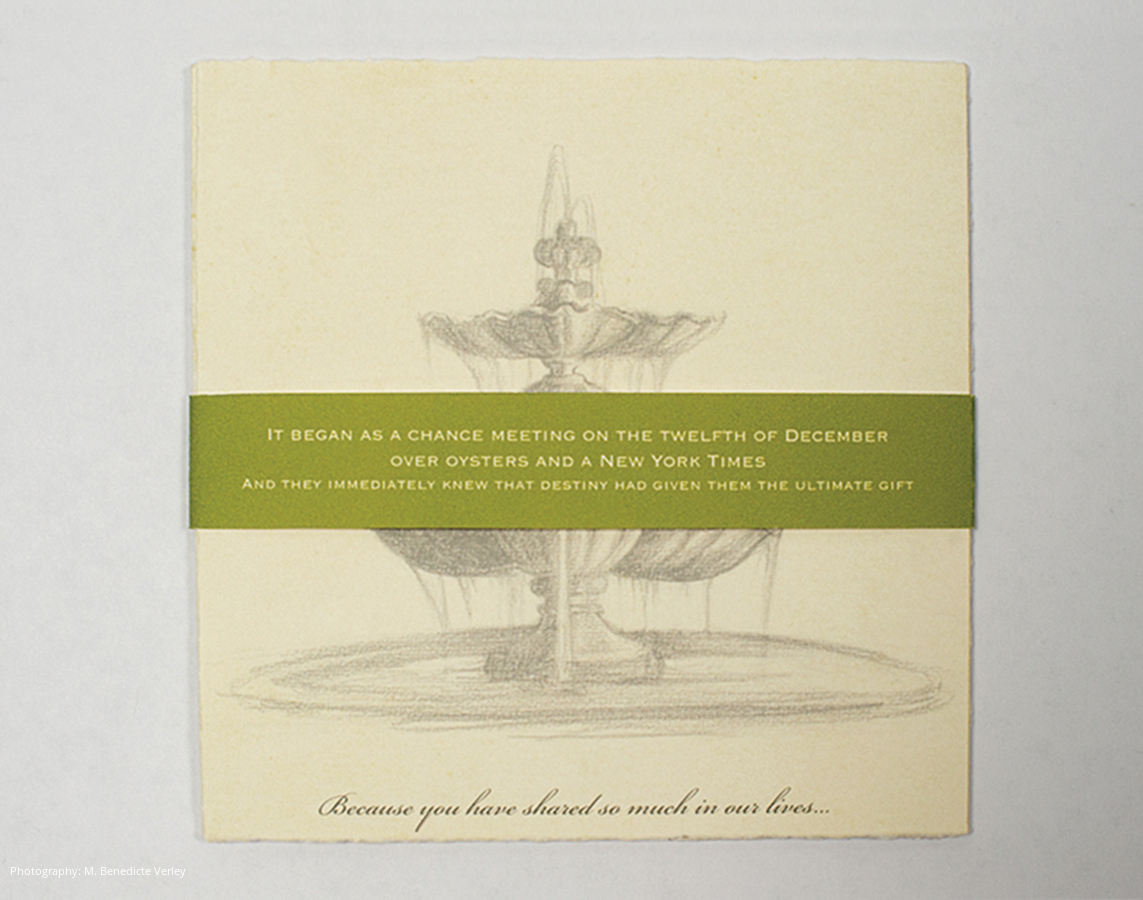
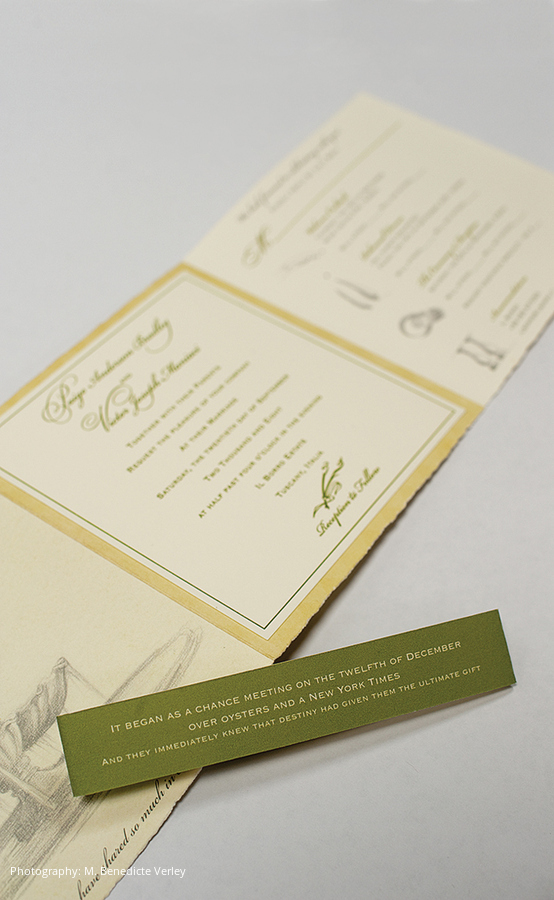
Couples are looking to take their guests on a figurative adventure, just as much as a real-life journey. Popular companies like Arak Kanofsky out of eastern Pennsylvania are known for working with couples to create hand-inked, painted and printed wardrobes to create individual works of art. One couple who was getting married in Tuscany, Italy, chose to incorporate a band around their destination wedding invitation suite paying homage to how they met: “It began as a chance meeting on the twelfth of December over oysters and a New York Times and they immediately knew that destiny had given them the ultimate gift.”
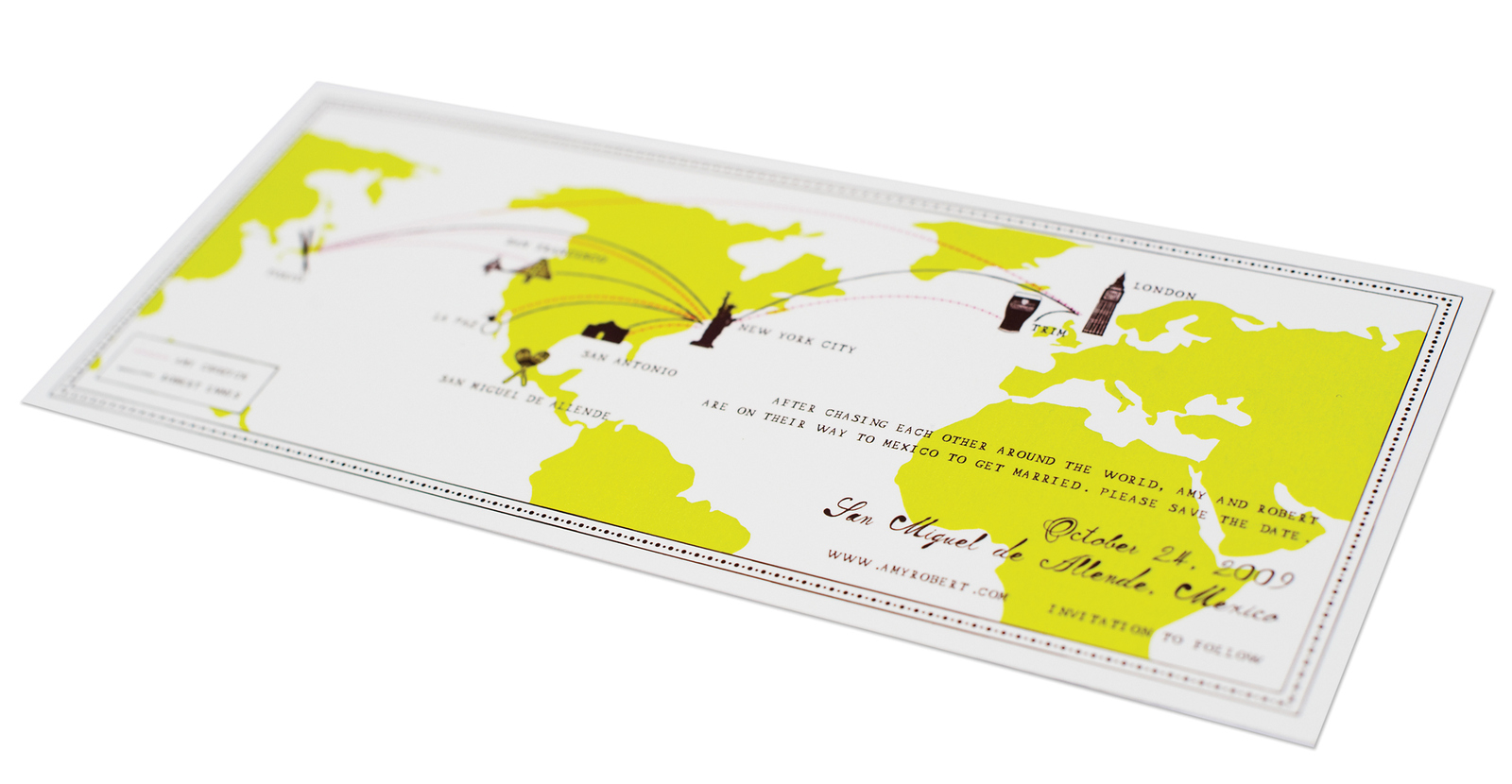
Companies like the more whimsical Mr. Boddington’s Studio in New York quite literally mapped out fate on a save the date when a couple asked them to showcase their individual, but concurrent journeys around the world: “After chasing each other around the world, Amy and Robert are on their way to Mexico to get married.”

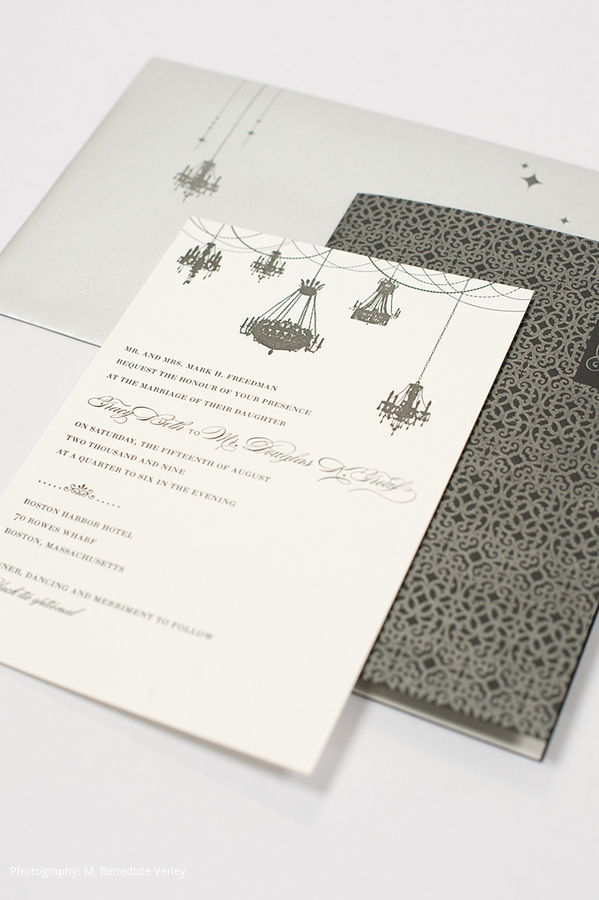
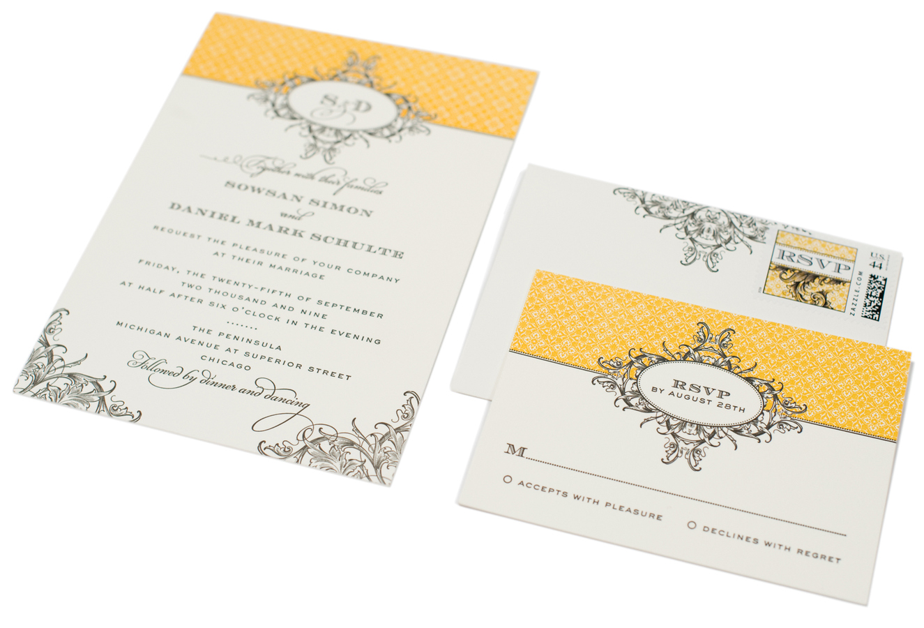
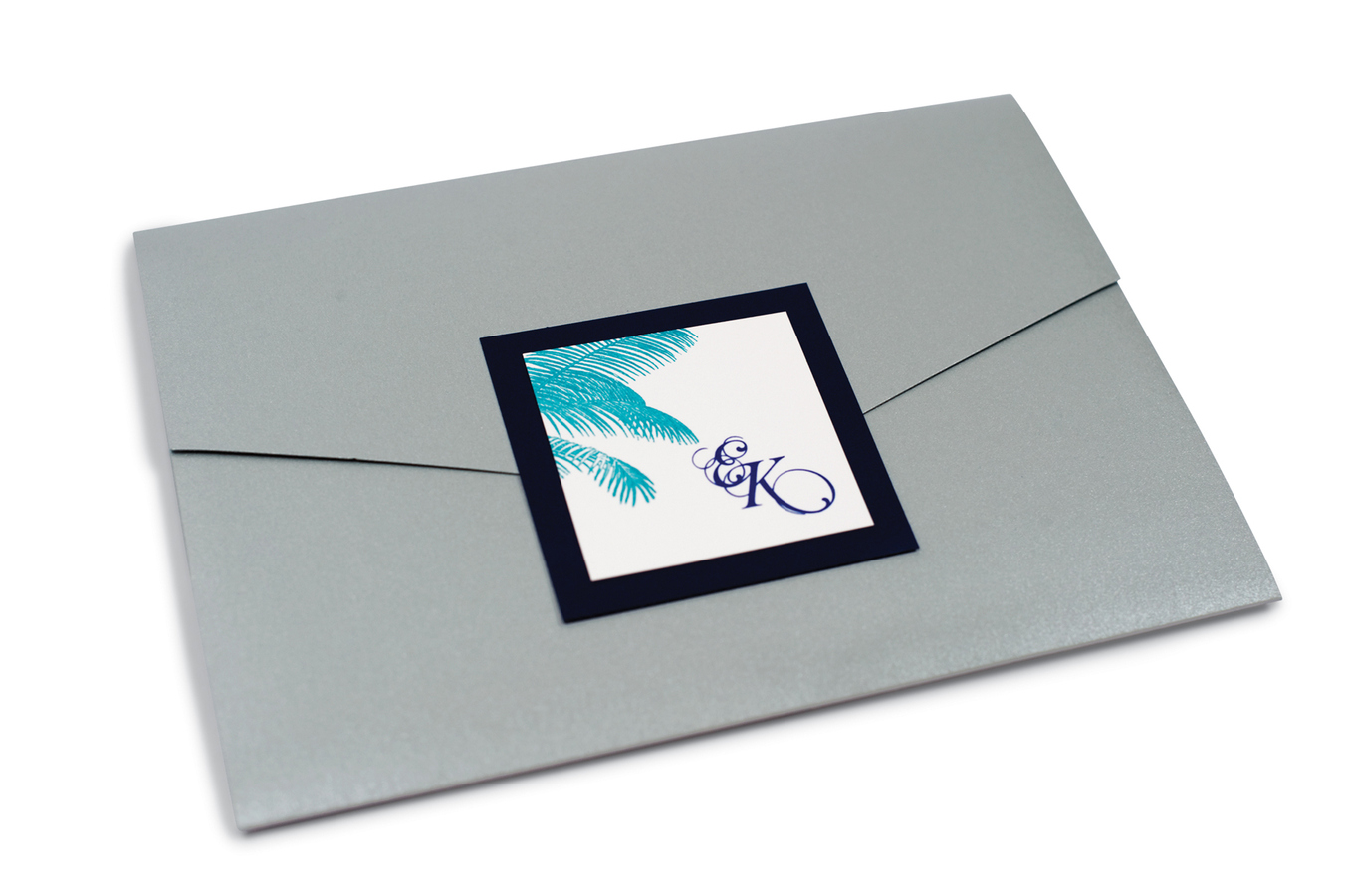
For other designers like Olio Style based out of San Francisco, their goal is to take a very modern approach. For a less conservative bride, a vibrant, custom monogram was created for the invitation and it coalesced right through all of the stationery, to the tags on the cashmere wraps for the ladies, and the lighting effect on the dance floor. Also located in San Francisco, designers like Viola Sutanto of Chewing the Cud took inspiration from the dramatic chandeliers in a reception site and interpreted them in a unique way. Injecting a slight edge, she mixed a palette of metallic grey with black and white showcasing illustrations of strung chandeliers right through to the front side of the envelope.

Regardless of your personal taste, your wedding stationery should be looked at as a way to express your wedding style. Even if you elect to stay with a more traditional white or cream paper stock, talk to your designer about experimenting with blind impression, paper sheens or colored and raised inks. Opting for something a bit more playful? Pair it with a pseudo neutral like grey or navy to keep it a bit more timeless. This is your opportunity to get your guests excited and filled with anticipation for the festivities to come.
> Written by Jessica Latimer;
Photography: M. Benedicte Verley
